Wednesday, 31 October 2012
Graphic Design Overview
I began looking at graphic design as an area of art and design almost completely created on a computer screen. Over the week, I have come to realize that although software like Photoshop is very useful, it is not a necessary component of every piece of graphics work. I enjoyed beginning the work with pen and pencil in thumbnails, then following the project through to the end, and tweaking it on the computer if it was called for.
Graphic Designers
Max Huber:


The work of Max Huber is mostly in the field of advertising, and he uses very bold lines, and colours. The work focuses primarily on shape and colour, and the type is rarely straight; it's always at a slight angle to mix with the images and make it more interesting to look at.
Erik Nitsche:
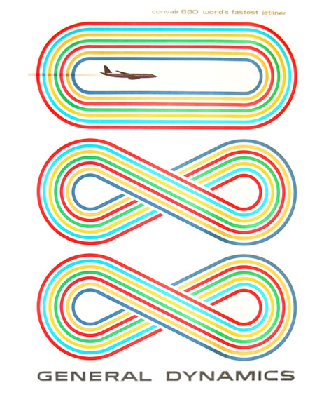

Erik Nitsche's work is identifiable by the clear shapes and focus on layout that he uses in his work, using simple type and bright colours.He is known primarily for his work with printed documents that require meticulous attention to detail.
Wolfgang Weingart:


In comparison to the other two artists, Wolfgang Weingart's work contains very little colour, focusing on the use of black and white and the shape that images make on the page. He uses a lot of type in his work, and it is part of the signature of his work, which was passed on to his students when he was teaching typography at Basel School of Design.
Storm Thorgerson:


Storm Thorgerson is a British graphic designer who has worked on many album covers and music videos. this mean that his work covers a range of media and subjects, however, all of his work is quite strange, and has an air of the impossible about it. He manages to combine reality with something totally impossible without seeing how it's created, in a way that is not initially strange, and it requires thinking about to realize the image isn't quite possible.
Chip Kidd:


Chip Kidd is an author and book cover designer, not necessarily a pure graphic designer, with the elements of illustration, but the different types on the covers and the way that everything is laid out is part of graphic design, and Chip excels at this. Each part of the covers reflects the contents, and the colour palette has obviously been thought about a lot to get the most impact and attract people. Book covers have an advertising side, as the covers must sell the book to those who see the cover, without giving away the whole plot but giving enough of a clue to make them interested.
Poul Lange:


Poul Lange is a bit of a man of all trades in the art industry, doing illustration, graphic design and aspects of fine art. This is evident in his graphic deign work because he uses a lot of collage, and composed his images in more of a pictorial sense with little type.
Friday, 26 October 2012
Noma Bar


I really like the work of this graphic designer because of the way that negative space is used to create more than one image in the picture. I think its great that the shapes used together create whole new images. This work reminds me of the artist Escher's work, as it has the same sort of interconnecting shapes that make each other.
Alan Fletcher


I quite like the fonts that Alan Fletcher designs, because although they're rather simple, with no flourishes or complex shapes, they are very different to what you see everyday. The elongated one in particular i like because it takes a lot of looking to distinguish between the letters of the alphabet; at first you don't believe the whole alphabet is there because it looks too short for it's height, but it is, and that i find interesting.
Wim Crouwel


I like some of the fonts that Wim Crouwel produces, because they're derived from objects that have a resemblance to that letter. This style of creating a typeface appeals to me because it uses the world \round you and is quite spontaneous.
Kris Sowersby


To me, this kind of graphic design is interesting in short bursts, and combined with other aspects, so some of the simpler type faces that Kris Sowersby has created don't interest me. However, the more unusual ones, i like. I particularly like this one done on a cake because it's so different, I've never seen anything like it before, and it combines several typefaces in the one section of text.
Creative Review, February 2012 Feature: Our top twenty slogans of all time
This is a collection of around 10-14 articles, that are based around many well known slogans, some of my favorites in this feature are 'Have a break, have a KitKat', 'Does exactly what it says on the tin' and 'Make Love Not War'. The articles go into the history of these phrases; when they we first used and the companies that created them. It's very interesting to see them in their original advertising roles, as we know them so well now, and the original response from the public. I think that these are interesting to me as it links something that I am already aware of with Graphic Design as well as adding additional historical context.
http://www.slideshare.net/LeoBurnettWorldwide/creative-review-rice-krispies-slogan-named-to-top-20-of-all-time
http://www.slideshare.net/LeoBurnettWorldwide/creative-review-rice-krispies-slogan-named-to-top-20-of-all-time
Thursday, 25 October 2012
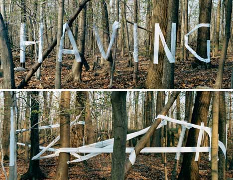
Pep Carrio

I like this work because it's more pictorial than a lot of Graphic work that you usually see. it also has bright colours, but they're not overwhelming because they're on their own with white. The patterns are complex, which allow you to keep studying them for a long time without feeling that you have seen it all.
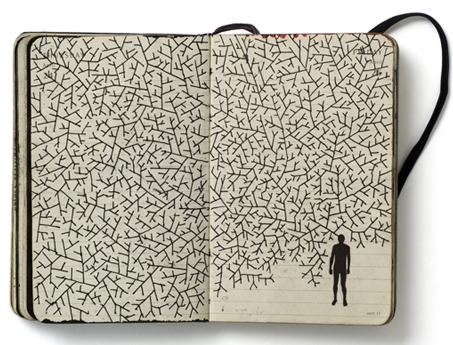
Stefan Sagmeister
I like this work because of how the detail is hidden at
first glance, because its viewed from only one angle, or it’s made up of
smaller, more intricate sections. The colour palette is also interesting
because it’s quite monochromatic, in neutrals combined with white.

Saturday, 13 October 2012


Sunday, 7 October 2012


Subscribe to:
Posts (Atom)